Banner Display System – Inspiration for Your Business

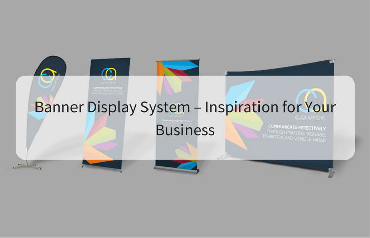
When you are in business, you want to get the very best for your advertising dollar, and roll up banners are one of the most important items you can have – especially when you are attending a trade show or exhibition. When you really want to stand out, these portable banners can make a big impact on your display and they are a great addition to your *point of sale* material.
One of the most important things to do – is to get the design and the information on your banner right – it needs to make an impact. Your banner should be treated just like any other part of your marketing strategy; you need to give your roll up banners the same care and attention you give to print ads, or brochures and leaflets. Your banner is simply another way of promoting your brand, product or service to a captive audience. Your design HAS to be effective when it comes to getting your message across. Roll up banners allow you to take your message on the road with you, and they are a vitally important tool at conferences, trade shows and exhibitions. If a banner has been designed effectively it will not only get you noticed, it will deliver your message perfectly.
Five ways you can design an effective Roll Up Banner
- Always keep your logo at the top – use the top section of your banner to display your company logo and your core message. You need to have your main message at eye level – this can be your brand name, your website or an image of your product. You need to have it at the level that it’s most likely to grab someone’s attention when they walk past it.
- Think – left to right – people are used to reading from top to bottom, left to right so you need to remember that when continuing on with the other banner information. Keep your words to a minimum and only include the relevant information. You can always give customers more information in brochures and flyers, on your website, or in person when they stop to ask questions. Less is more when it comes to designing your roll up banner.
- Images – if you want to, or need to include images on your banner – especially product images then you need to ensure they are of high quality. They should be at the very least 300dpi and saved as CMYK ready for print. Don’t just pull images off the internet and pop them into your banner design. These types of images will be of poor quality. Always keep in mind that you are trying to capture people’s attention – you want to draw them towards your product or service. There are royalty free images that you can use, if you can’t get or don’t have any good quality copies of your own products, these stock images are generally free, which is helpful to anyone just starting out and on a strict budget.
- Colour – while colours ARE great, and they can definitely help make your banner stand out at a show or exhibition, the colours need to tie in and work well with your existing logo and corporate colours. You also need to consider the *impact* the background colour of your banner will have in relation to the text and images you want to use. All the images you use and the text has to be clear and easy to read on your banner. Bright colours like orange and red really grab people’s attention, but try and avoid using white and yellow together, as they can make reading anything – especially from a distance, quite hard. If something isn’t easy and fast to read – people just won’t bother trying.
- Contact details – and finally, when it comes to your roll up banner – don’t forget to add your contact details. This is very important, especially if you are using your banner at a trade fair or exhibition, you might not get a chance to talk to everyone. Having your contact details displayed gives visitors the information they want or need on how best to contact you, whether they want to find out or more, or want to purchase your product or service. If you don’t include your phone number, web address and e-mail, include at least one along with any social media links. People sometimes prefer to get in touch with a business through their Twitter or Facebook accounts. Contact details are best placed at the bottom of your banner, but they must be both clear and easy to find.
Read Also:


